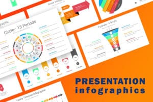
Presentation Infographics
Infographics are a powerful tool for presenting complex information in a visually appealing and easily understandable way. They combine visuals, text, and data to convey key messages and engage the audience. In this document, we will explore the different elements and best practices for creating effective presentation infographics.
1. Purpose of Presentation Infographics
- Presenting data: Infographics are an excellent way to present data in a concise and visually appealing manner. They can help highlight trends, patterns, and comparisons effectively.
- Simplifying complex information: Infographics can break down complex concepts into bite-sized, easy-to-understand visuals. This makes it easier for the audience to comprehend and retain the information.
- Enhancing engagement: Visuals are more engaging than plain text. Infographics can capture the attention of the audience and keep them interested throughout the presentation.
2. Key Elements of Presentation Infographics
- Visuals: Infographics heavily rely on visuals such as graphs, charts, icons, illustrations, and images. Choose visuals that are relevant, easy to understand, and visually appealing.
- Text: Keep the text concise and to the point. Use headings, subheadings, and bullet points to break down information. Use a legible font and ensure proper spacing for readability.
- Color scheme: Select a color scheme that aligns with the presentation’s theme and evokes the desired emotions. Use colors strategically to highlight important information and create visual hierarchy.
- Layout: Organize the information in a logical and coherent manner. Use a grid-based layout to ensure consistency and alignment. Balance the visual and text elements throughout the infographic.
- White space: Leave ample white space to avoid clutter and improve readability. White space also helps in directing the audience’s attention to the most important elements.
3. Best Practices for Creating Presentation Infographics
- Know your audience: Understand the needs and preferences of your target audience to create infographics that resonate with them.
- Use reliable data: Ensure that the data used in the infographics is accurate, up-to-date, and from credible sources. Provide proper citations if necessary.
- Tell a story: Infographics can be more impactful when they tell a story. Create a narrative flow that guides the audience through the information.
- Keep it simple: Avoid overcrowding the infographic with excessive information or visuals. Stick to the key points and remove any unnecessary elements.
- Test and iterate: Before the presentation, test the infographic with a small group and gather feedback. Make necessary revisions and improvements to enhance its effectiveness.
Conclusion
Presentation infographics are a valuable tool for presenting information in a visually appealing and engaging manner. By incorporating key elements and following best practices, you can create infographics that effectively communicate your message and captivate your audience. Remember, simplicity, clarity, and visual appeal are key to creating impactful presentation infographics.